The 2.2 tomato plants histogram answer key is more than just a set of correct answers; it’s a gateway to understanding one of the most fundamental tools in statistics. If you’ve encountered this problem in a textbook, assignment, or online course, you might be tempted to just find the solution. However, the true value lies in mastering the process. This guide provides the ultimate “proven solution”—not by simply giving you an answer, but by equipping you with the knowledge to solve this problem, and any other histogram problem, with confidence.
We will deconstruct the entire process, from raw data to a fully interpreted histogram. We’ll use a detailed case study of a hypothetical tomato plant experiment to walk you through every step, demystifying concepts like bin width, frequency distribution, and data shape. By the end of this article, you won’t need an answer key, because you’ll be the one who can create it.
What Exactly Is a Histogram and Why Use It for Tomato Plants?
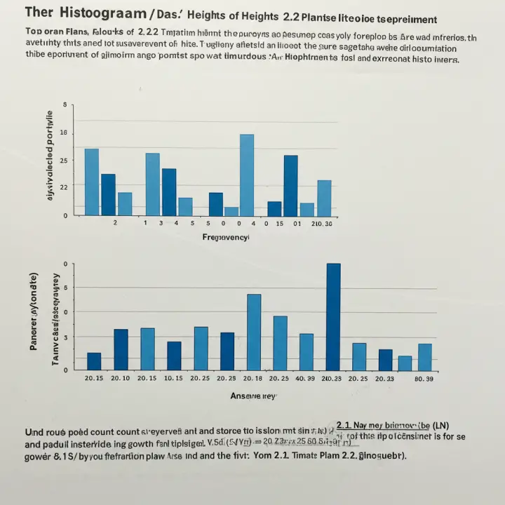
Before we dive into calculations, let’s establish a solid foundation. A histogram is a graphical representation of the distribution of numerical data. It might look like a bar chart, but there’s a crucial difference: a histogram groups numbers into ranges (called “bins” or “classes”), while a bar chart typically compares discrete categories.
Key Differences Between a Histogram and a Bar Chart:
Data Type: Histograms are used for continuous data—data that can take any value within a range (e.g., height, weight, time). The height of a tomato plant is a perfect example. A plant isn’t just 30 cm or 31 cm; it could be 30.725 cm. Bar charts are for categorical data (e.g., types of cars, favorite colors, different tomato varieties).
Bars: In a histogram, the bars touch each other to signify that the data is continuous across a range. In a bar chart, the bars are usually separated by gaps.
X-Axis: The x-axis of a histogram represents a continuous range of values, broken into intervals. The x-axis of a bar chart represents distinct categories.
So, why is a histogram the ideal tool for analyzing our tomato plants? Because it allows us to see the bigger picture. Instead of looking at a long list of individual plant heights, a histogram visually summarizes the entire dataset, helping us answer questions like:
What is the most common range of heights for the tomato plants?
Are most of the plants a similar height, or is there a wide variation?
Are there any unusually tall or short plants (outliers)?
Is the distribution of heights symmetrical, or is it skewed?
This visual summary is the first step toward making meaningful statistical inferences.
The Proven Solution: A Step-by-Step Walkthrough
To make this practical, let’s create a sample dataset for our “Problem 2.2.” Imagine a botanist has measured the height (in centimeters) of 50 tomato plants four weeks after germination.
Our Sample Data: Heights of 50 Tomato Plants (cm)
| 45.1 | 51.3 | 48.2 | 55.4 | 46.7 |
| :— | :— | :— | :— | :— |
| 49.5 | 58.0 | 50.1 | 52.3 | 61.2 |
| 53.6 | 47.8 | 51.9 | 49.9 | 50.8 |
| 62.1 | 54.5 | 50.5 | 44.9 | 56.7 |
| 48.8 | 52.8 | 57.3 | 51.0 | 49.2 |
| 50.3 | 53.1 | 64.5 | 55.9 | 51.7 |
| 46.2 | 52.1 | 58.8 | 53.9 | 48.5 |
| 51.5 | 60.1 | 54.2 | 47.3 | 50.0 |
| 49.0 | 56.1 | 52.5 | 53.3 | 43.1 |
| 51.8 | 54.8 | 50.7 | 59.3 | 52.0 |
Here is the step-by-step method to turn this raw data into a complete solution.
Step 1: Analyze Your Raw Data
First, get a feel for your data by finding the basic descriptive statistics.
Count (n): The total number of data points. In our case, n = 50.
Minimum (Min): The smallest value in the dataset. After scanning, we find the minimum height is 43.1 cm.
Maximum (Max): The largest value in the dataset. The maximum height is 64.5 cm.
Range: The difference between the maximum and minimum values.
Range = Max – Min = 64.5 – 43.1 = 21.4 cm.
This tells us that all our plant heights fall within a 21.4 cm spread.
Step 2: Determine the Number of Bins
This is one of the most critical steps. The number of bins you choose can significantly change the appearance and interpretation of the histogram.
Too few bins: You lose detail and might miss important patterns.
Too many bins: The histogram becomes too noisy and the overall distribution is hard to see.
A common and reliable method is the Square Root Rule:
Number of Bins ≈ √n
For our data, n = 50, so √50 ≈ 7.07.
It’s best to use a whole number, so we’ll round this to 7 bins.
Step 3: Calculate the Bin Width
The bin width determines the range of values each bar will represent. The goal is to choose a convenient, round number that covers the entire range of your data.
Formula: Bin Width ≈ Range / Number of Bins
For our data: 21.4 / 7 ≈ 3.057.
To make our bin boundaries clean and easy to read, we should round this number up to a more convenient value, like 3.5 or even 4.0. Let’s choose 3.5 as our bin width for more precision.
Step 4: Create the Frequency Distribution Table
Now, we’ll create the bins (class intervals) and tally how many data points fall into each one. This table is the backbone of your histogram.
We should start our first bin slightly below our minimum value (43.1) to ensure it’s captured. A good starting point would be 43.0
Note: The notation `[43.0 – 46.5)` means the bin includes 43.0 but is up to, and not including, 46.5. This prevents any data point from falling into two bins.
Step 5: Construct the Histogram
With our frequency table complete, we can now draw the histogram.
1. Draw the Axes: The horizontal x-axis will represent the “Height of Tomato Plants (cm),” and the vertical y-axis will represent the “Frequency” or “Number of Plants.”
2. Label the X-Axis:** Mark the boundaries of your bins along the x-axis (43.0,